Wednesday 28 December 2016

Blooming Great


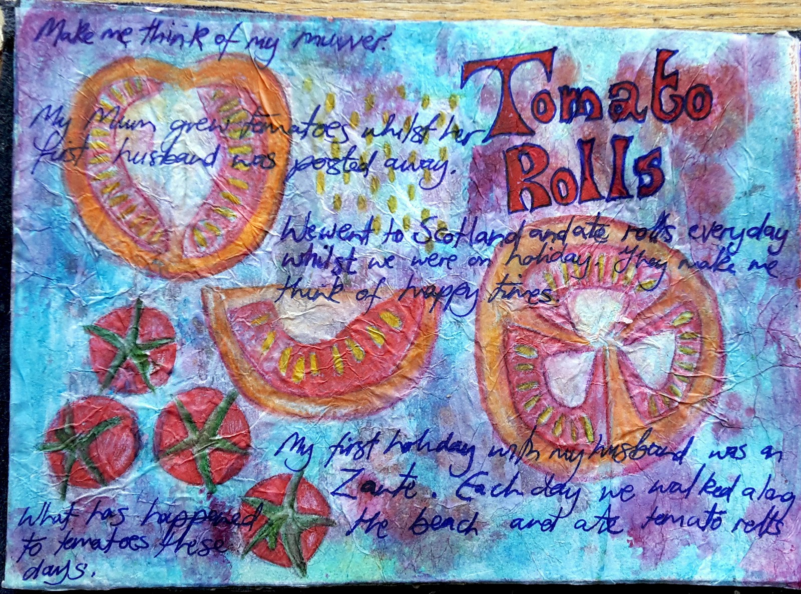
This was a fun and experimental page to produce.  I've been working with artist Carole Miles in finding creative ways to use baby wipes to support Anglian Water  with their "Keep it Clear" campaign.  We work under the guise of The Eloquent Fold which comprises of me and Carole Miles a mixed media print community artist.

The difficulty with baby wipes is there reluctance to take on dye of any description.  The colour looks good and positively vibrant when it is wet but by the time it dries it sort of fades and is most disappointing.  I'm determined that there must be something out there that would work.  Brusho is the closest I've come to finding a colouring agent that works.  Still more experimenting I guess. I think we've also come to the conclusion that having the baby wipe material before 

Anyway at Christmas, I worked with Carole at a couple of events spreading the Anglian Water campaign and I decided that I would keep all the used baby wipes that people had used to clean their stamps.  I now have a big stack of them ready to  be experimented on.  I'd seen an video on YouTube where a woman had glued a pre-used dry baby wipe to a journaling page and worked over it. Interesting, I thought, let's give this a  bash.

First I chose a couple of interesting baby wipes and glued them to the page.  One  of which I cut up and only used small sections.  Next I used took one of my home-made stencils and some acrylic paint; lilac and baby blue to stipple over the stencil.  The colours didn't show up greatly but by the time I had added some silver glitter glue and some contracting colours in the centre of the flowers it started to show some promise.

As petals, I used the dots from my hole punch which I had collected from a two workshops I ran around Christmas time.  The finishing touches were, painted acrylic stems in green and a little hand lettered banner.

All is good.


Wednesday 31 August 2016

Looking to the future

Quite often when I work on a page it takes a while before it forms into a theme or an idea. This page started out by me using a book from the library that I had been gifted when I worked over in Boston Library.  I'm not sure what the language is but I love the patterning it makes across the page.  That was my starting point.


Then I painted a wash of pale blue and a mid green after I had a attached a small segment of branches.  To that I added a stamped image of a heart which I haven't really used.  In fact, journalling has given me the excuse to use my rubber stamps again.

The next stage was adding a landscape; adding grass using paint and gel pens and creating more of a tree.  Then I embellished the stamped image using the Sakura Gelli Roll Glaze pens.  They are lovely to work with and add a slight sheen, as though you used a fine tip varnish pen if ever there was such a thing.

Finally, I added a self portrait, which I have to say makes me look a little manic but hey, then added a the writing last.  It's a bit of a shame the second half of the phrase couldn't be picked up by the camera.  Next time I will be aware not to use a metallic pen.

Tuesday 21 June 2016

Don't Worry

I just love that song by Bob Marley, Three Little Birds.  Here's my visual interpretation of it painted in watercolours and outlined with a micron pen.


Monday 20 June 2016

Picture Perfect

This art journal page has actually evolved since I finished it.  I have been experimenting with bleach on paint and it's bled through to this page.  I quite like it actually.

I always have a starting point with a page it could be a word, a picture or something I see during the day.


In this instance I had an image of a Victorian woman using a trip-pod to take her photographs.  Then I created the doodled  wood.  Thin trees which would allow me to add something of interest. I decided on hot air balloons as they are slow and it perhaps would have been something an old camera would pick up.  I used some free images on line.  I then used one of my stencils and some hot shots acrylic paint to add a bright grid in the  background before applying the trees and hot air balloons.

I had intended to transfer the image directly onto the page but the colour didn't transfer as well as expected so I had to hand draw the details with a Gelliroll  glaze pen which ended up making the women look like a transfer.

Sunday 19 June 2016

Discover

The starting point for this page was the Taj Mahal, a travel advert which I layered it using different techniques.

Layering inks; the metallic reacts beautifully with the plain giving you little bubbles.

Drizzling ink: I drizzled some blue acrylic paint along the top edge and let it roll over the page.

Silhouetted: I looked up some free images of indian dancers, printed them off and traced them using carbon paper on the page then filled in with a black pen.

Luna lights: I dabbed some Luna lights in gold along the bottom to give the Taj Mahal a bit of a lift away from the dancers.

Doodles:  Last but not least I doodled a couple of paisley shapes.


Saturday 18 June 2016

Have you ever smoked?


I have say, this art journal page is not of my usual styling, but I really like the collaged image that i found in a computing magazine and it sparked me thinking.

The world has moved from smoking to vaping, and despite all the negativity surrounding the former we seem to have moved onto a cleaner version that, in my opinion, has been fully tested for the effects it may have on your health.

Friday 17 June 2016

It's the simple things

A while ago I purchased Jane Davenport's book Drawing and Painting beautiful faces.  I'm trying to improve my painting and drawing skills and this book has been quite useful as she uses quite a lot of different mediums to produce the faces.


I used watercolour over a Gesso base then once it was dry I worked over it with soft coloured pencils from Specialist Crafts to add more detail; finishing off with a list of simple things that make me happy.

Hope you enjoy this art journal page

Thursday 16 June 2016

Tomato Rolls

Odd title for a journal page I know, but tomato rolls always give me happy thoughts.  Again, strange I hear you say.

It's a meandering story with lots of tendrils.  Tomatoes, make me think of my muvver whose time to leave me was in 2011.   She was a very strong but gentle women who was well respected and loved in the family and before she passed she saw and held a great grandchild and a great great grandchild.

She was first married at nineteen, she told me she was far to young.  Her husband, Osbourne (his surname) was in the services and was quite often posted away so my Mum was left with meagre means to live on.  So she decided to grow tomatoes, this she said helped her through the rough times when all she could afford was a loaf of bread.


At fifteen, she took me on a tour of the castles in Scotland.  No hotel, no place to stay, we would find somewhere when we got there.  At the time I was horrified, this unsettled me that there was no plan.  Remember this was in the days before the internet so you couldn't just do a search to see if there were places to stay.

We ended up staying in a lovely B & B and used that as our base.  Each day we would go out and visit a different castle or place of interest armed with tomato rolls, mushroom soup, some tunnock bars and a flask of tea.

These memories stay with me and even to this day, if I am out for the day I am more than happy taking with me some rolls, tomatoes and a fruit knife.

And how did I create the page?  Using, alcohol pens, tissue paper, water soluble crayons and a pen.

Monday 13 June 2016

Sometimes all you need is a hug

This journal page says it all really.


I used transparent Gesso to lay a foundation on the page before I applied grey, pink, turquoise and white acrylic paint with my fingers to create a background.  I then glued down a couple of collaged accents; the white bubbles on pink paper was a test piece I had used to test my moulding paste recipe and the image of the little girl with outstretched hands came from a free vintage image website.  Finally, the writing was a tracing of a free font called, Starry Night.


Sunday 12 June 2016

Indian Rug


A bit of a tie and dye effect for this page.   I used alcohol pens along with surgical spirit to achieve this lovely random colouring, then I worked over it by drawing an elephant and the border pattern to give it an indian rug feel.

Saturday 11 June 2016

The Artist

A collage of random images come together and layered over what I would call a scrap page.  A scrap page is where I smear left over paint and ink giving me a page almost good to go.

With this one I stencil a pattern using one of my masks and a blue distress ink pad applied with a make-up sponge.  To lift the colours on the background I used a pale yellow, mid purple and a touch of blue grey and smeared them with my finger tips around two of the corners before applying the cut out images.


Friday 10 June 2016

California Dreamin

This is the third page I have created using my homemade molding paste and possibly the most successful.  As soon as I layered on the other pages the texture from using the masks (stencils) disappeared.

To get the stamped image and writing to sit right over the texture I used tissue paper then blended each in using a little acrylic paint.


I hope you like it.

Thursday 9 June 2016

Starry Night

The background for this page is made up of Distress and Spritzing inks. There was a reaction between the metallic and plain inks leaving dots which made me think of stars then the Van Gogh's painting, starry night.  I used acrylic paints to create the stars along with a thick white Posca pen and Gelly Roll pens to give the effect of the bright stars.


Wednesday 8 June 2016

Beauty

Using my newly acquired Sakura glaze pens I created a doodle butterfly from book pages.  By the time I had finished my doodles there wasn't much left of the text showing through but I do like the paper colour and, to me, it had a real Japanese feel to it hence the title.


The background was achieved using Kuretake paints with lots of water to allow it to flow and bleed.

Tuesday 7 June 2016

Beautiful Dreamer


I'm a little bit disappointed at how this journal page turned out although on the other hand I really like it.

If I explain, this is this the second page where I have used my homemade molding paste (recipe shared yesterday).  After thickening the paste I was really please with the effect and boldness of the result after using the stencil.   I painted over it with acrylic paints then touched it up with some distress inks and glimmer inks to give it a little sparkle.

Where the face is concerned, I don't always feel confident drawing faces so I quite often use copyright free line drawings as a starting point, then carry on to add my own touches to it.  I wanted to keep the image transparent as I didn't want it to detract from the writing.  I used the parlour song, "Beautiful Dreamer" by Stephen Foster which most people may remember was sung by Bing Crosby. Finally I coated the page with a layer of matt Modge Podge

I feel this page has a ethereal look about it which I am more than happy about, but I am a bit disappointed that the texture was lost.

Monday 6 June 2016

Breast is best

The workings of the breast is complicated.  It's function is to provide us with a portion of our feminity.  It nutures our children, it forms a comfort blanket, it allures and attracts.


This page was the about exploring texture.  I've discovered a recipe for molding paste on Linda Donelly's blog and I'm always up for trying out different ways of doing crafts without spending a fortune on products.  The recipe (non edible) calls for 1 part acrylic paint, 1 part talcum powder and 1/2 glue (I used Modge Podge).  Mix it thoroughly and it's ready to use with your stencils or mark making tools.  I did find I needed to add a little bit more talc as it seemed a bit runny, if you look in the images some of the white bubble shapes have smudged, but otherwise I like the result.

Sunday 5 June 2016

Right on Time


The concept of time has always fascinated me.  When is the right time?  Time goes slowly when you're not enjoying yourself and really fast when you are.  I'm sure I am not the only one who feels that they can squeeze more things into a given time.

This page was an excuse to use some of the decoupage paper I had left over.  I bought it for £1.50 from my local The Works shop and added to my old hand crank Singer called "Jonesy" to make him a little more personalised.  He really is a lovely machine, solid and a great one to take out to workshops to allow people to experience sewing with a machine the gentle way.

So the cogs you see in this page are the decoupage paper, the rest of the page is covered with cream, brown and gold tissue paper, then I've used a pink highlighter to emphasise areas of the page.  handwritten letters and roman numerals complete the look.

Saturday 4 June 2016

LEMON: fruit. tree, colour (yellow)


It's interesting where ideas come from for the art journal pages.  I tend to allow my mind to drift to various places and build on those thoughts.  I had been thinking of the times I had travelled to Spain or Greece and how readily available citrus fruit is.

I journeyed back to one such holiday where I plucked a lemon from a tree whilst out bike riding.  How wonderfully fresh and tangy and full of life that lemon seemed to taste in my drink.

This is the first time I have used textile in a page and I quite like the 3D effect it has given the overall feel of the tree.  As per, I used what I had available to me, which was a left over bunting triangle which just happened to have a leaf print.  After painting them with acrylic paint I found I had to cut the leaves in half as they were twice the size of the lemons.  I then looked for words relating to lemons and lemon trees; poems and songs.

I used the poem "The Lemon Tree" by changers writer and a line from the folk song by Will Holt made famous by Peter, Paul and Mary plus the third verse of the poem "A Lemon" by Pablo Neruda

The background was created using acrylic paints and layer with gesso to add in the truck of the tree.  When make or create, things tend to happen organically, hence the small label that was sitting in my scrap box.... perfect.
SaveSave

Friday 3 June 2016

Welcome to my Garden, a cacophony of collaged flowers seen through a window drawn with alcohol pens.


Thursday 2 June 2016

I am grateful for......

How many things can you be grateful for?  Can you count them?  This was quite the challenge and I really had to put my thinking cap on but once I got started the ideas started to flow.


Wednesday 1 June 2016

Mandala


This mandala was created using Kuretake paints and alcohol pens.  It's not evenly space but I think the imperfection works.

Monday 21 March 2016

Shadows on the road

Since doing this challenge, I am looking at my environment in a slightly different way.  I look at the backgrounds in my journal or I am cutting words out of a magazine and an idea for a page pops in my head.

I was heading over to the Wistow Gallery,in Leicester yesterday to do a Photo Textile jewellery workshop when I noticed the shadows on the road.  Shadows remind me of books I read as a child, by Enid Blyton or E Nesbit and many others.

This page was created using alcohol permanent pens.  I love the way you can layer the work, yet still see you pen strokes below.


Thursday 17 March 2016

Protect and Reflect


This is a re-make or update of a page I did many moons ago.  It's an exercise in building a verbal and visual picture of yourself.

Start with a image of a person and then build amour around them, adding words that could be inspirational or hopes and dreams or where you are now.

The page background was made up of a hodge podge of layers; tissue, watercolour paint, gold acrylic, music paper and a magazine image.

Tuesday 15 March 2016

View From Here - Printing Flowers with Carole


This week the Threads and Chatter group explored printing with artist Carole Miles using printing ink and polystyrene sheets.


Prints created at the session will be used to produce a perspex sunscreen for a new area at The Green Patch The Green Patch  Each person at the workshop designed one petal for the flower by drawing on a pre-cut polystyrene petal.  Each petal was inked up and placed on the paper to form a new design each time.

I can't wait to see the finished result.


Thursday 10 March 2016

The Bluebells


This time I worked with a cleanish white page.  When I say cleanish I mean there was a little staining from other pages at the edges.

I worked with permanent or alcohol pens, Sharpies, Promarkers etc.  The poem was written by Emily Bronte and the full poem is below.

One the whole page was drawn and the poem added, I felt that the words didn't show up that greatly so I decided to put some white back onto the page by using a correction pen.  This adds some dimension to the overall look I feel especially adding a few highlights to the bluebells.


The Bluebell is the sweetest flower
That waves in summer air:
Its blossoms have the mightiest power
To soothe my spirit's care.

There is a spell in purple heath
Too wildly, sadly dear;
The violet has a fragrant breath,
But fragrance will not cheer,

The trees are bare, the sun is cold,
And seldom, seldom seen;
The heavens have lost their zone of gold,
And earth her robe of green.

And ice upon the glancing stream
Has cast its sombre shade;
And distant hills and valleys seem
In frozen mist arrayed.

The Bluebell cannot charm me now,
The heath has lost its bloom;
The violets in the glen below,
They yield no sweet perfume.

But, though I mourn the sweet Bluebell,
'Tis better far away;
I know how fast my tears would swell
To see it smile to-day.

For, oh! when chill the sunbeams fall
Adown that dreary sky,
And gild yon dank and darkened wall
With transient brilliancy;

How do I weep, how do I pine
For the time of flowers to come,
And turn me from that fading shine,
To mourn the fields of home!

Perhaps in days gone by, bluebells used to bloom in summer.  So strange how our seasons have changed.  I'm not sure we really have defined seasons anymore.


Wednesday 9 March 2016

Let your hair down


I've been struggling with the black sugar paper pages I put in my journal.  It's finding pens, crayons, inks and paints that will cover the blackness successfully.

With this page I used good quality crayons.  Here I have used a combination of the student coloured pencils from Specialist Crafts and Derwent crayons.  Both have a good coverage and are lovely and soft to use.  The top part of the page is an envelope inner which has been marbled lightly marbled, although I feel it hasn't really shown in the image  The lettering and swirls were completed using permanent pens.

I think the woman looks a little intense and slightly Fae.

Tuesday 8 March 2016

Seeds of Change


This page started with a random used page found in my scrap box it had some olive green ink smeared in the middle and some random circles drawn on it by someone at one of my workshops.  I don't like waste and I thought it would be a good starting point to develop a page.

Materials used:  A window envelope, a strip of decorative paper, a flower cut from some wallpaper, turquoise ink, gel and highlight pens and the typewriter.

The journal page represents how change can come about from the simplest of ideas.

Monday 7 March 2016

Permission to Fly


I really enjoyed putting this page together as it was a gradual process and a mish-mash of various papers, stickers and stamps.

Materials used include a gold foil from a chocolate bar, crepe paper, book paper, map paper, butterfly stickers and rubber stamp.  Handwritten and stamped words and a spray of brush ink.

Saturday 27 February 2016

Art Journalling with a Key theme

I have a lovely collection of large keys on my window sill in my lounge.  I acquired them from a car boot and was very please to give them house room.  They have been coated with a thick black paint so I guess most people would have passed them by, but I thought they had some presence.

My journal is a mix of different papers including brown paper, I love a challenge although it is rather difficult to work with thinner paper.

This page has evolved over a period of time.  First I added torn strips of masking tape in readiness for when I wanted to use the page.  I love using excess paint of my brush on other pages in my journal. I'd been using gold one day and like the idea of creating a shimmer on the brown paper. After sketching the keys using my waterbased wash pens I ripped off the masking tape which also tore away some of the key images.  I just went over them and this gave them a two-tone effect. I then wrote over the whole surface using a pink metallic gel pen.  I love the way the writing looks pink then silver in some places.


Friday 26 February 2016

Make a Wish


Just the gesture of this vintage lady gave me the idea for this page.  I thought her headdress looked like a dandelion clock.

Thursday 25 February 2016

I give myself permission to play


A great way to get yourself started.  I used the phrase, "I give myself permission to play".  One of the group suggested that this journal page had the feel of "Three Acre Wood" in the Winnie the Pooh Stories.

Monday 25 January 2016

Dream a little dream

A background of spritzer inks followed by stamping, a watercolour wash and some alcohol pens for the dots.  I tried to transfer the photocopied image using a blender pen but it just didn't budge or I was doing something wrong.


I didn't want to waste the image so I used a sepia alcohol pen to give it more of a vintage feel then I created a frame using some strips of paper I had sprayed ink over.  I really love the song, "Dream a Little Dream", so I decided to add a little pocket containing the first verse.

Sunday 24 January 2016

Down at the bottom of the Deep Blue Sea


The background to this page was created using my lovely Kuretake paints.  They seem to be a cross between a watercolour and a gouache paint leaving a good dense colour on the surface of the paper.  This made me think of all those creatures swimming around in the depth illuminated in the dark.   I created this using a mix of gel pens; Saruka gelly roll glaze pens, Mitsubishi Gel pens

I am quite happy with the final result.

Saturday 23 January 2016

Many faces


Here's an exercise in drawing faces which isn't my favourite thing to do.  I do like how it is lovely and bright though.  I was using my water based brush pens.

Friday 22 January 2016

NUTURE. GROW.


I  was looking through my stack of Cloth, Paper, Scissors magazines and came across an interesting article called Visual Journaling by Melanie Testa (issue 24 May/June) . In it she shared a little of her process, one of which is using tracing paper in her journals.  When she is out and about she takes sketches of things of interest e.g. a bird or a flower, then she comes home does the research and draws it again, this time on tracing paper.  This allows her to be able to use that sketch again and again.

She uses tracing paper not only to sketch on but also to paint on.  Now this initially made me a little nervous.  Putting paint onto tracing paper will instantly cause the paper to distort. However Melanie suggests, "You can also play with the tracing paper's ability to stretch and expand while applying the tracing paper to your work."

Being a girl that uses what I have to hand I decided to try working on tissue paper.  I knew this would throw up more of a challenge but I was well and truly inspired and ready to go and here's the resulting page.

Within the page above I have created a background from left over wet ink and paint from other pages I had been working on so it was basically all ready to work on.  I sketched then painted my one year old jade tree onto the tissue paper then painted it using my Kuretake paints, I love their vibrancy.  Whilst waiting for the paint to dry I cut out some graph paper and outlined a couple of words to link to the plant.  I love my little jade plant, I found it on a cold December morning in 2015. I brought it home as a small branch.. Many people believe that the more these plants flourish the more affluent you will become or perhaps it's you won't be short of money.  Whatever the believe, I used to have one for coming on 40 years and then it just gave up the ghost.  No amount of water, sun, re-potting helped it.

I hope you enjoy the page.

take pART project: "You can find me right here" - week one

With the first workshop complete, I feel happy that I have come up with some very pleasing two hour creative experiences for the groups at Spalding and Boston Libraries.  This week, I showed the group how to make a folded star book using stitched maps.

Next week, the group will go on a journey of choice and learn how to make a meander book.


Thursday 21 January 2016

...by the sea


Working with my Kuretake paints and table salt I wanted to create a beach scene.  The salt really does give it a textured, grainy effect which makes it almost impossible to work over in any detail so I decided to use a image transfer method using sticky tape.  It's an interesting effect to experiment with and it's great to see the reaction salt has on the paint.

The process is quite straight forward, but can be a bit unpredicable, some paper works better than others.

1.  Cut a small image from a magazine or book and place it image down on the sticky tape.

2.  With the sticky side of the tape faced up, wet the back of the image.  In my case it showed some printed text.

3.  Rub the surface in a gentle circular motion until the paper starts to roll.  Add a little more water with your finger when needed.

4.  Keep rubbing in this way until you see only the image and it becomes transparent.

5.  Now apply it to your project.


Wednesday 20 January 2016

Growth and Movement in Plants


I  really like the fantasy almost ethereal quality to this page.  To get this effect, I sprayed the surface before spraying inks over the surface and allowing to disperse.  Once dried, I added small marks, dots and dashes using my brush pens.  Finally I stamped a fairy and added some text and illustrations from an old gardening book.

Tuesday 19 January 2016

Echinacea Augustifolia


I love the colour palette in this art journal page. I've used yellow and purple to lay the bas then stamped into the surface using bubble wrap.  The flowers are from an old gardening magazine and I wrote the title with my Pentel black brush pen.

Monday 18 January 2016

Peacock Feathers

This page is worked over some blue tissue paper with my brush pens.  These are vibrant and easy to use.

Sunday 17 January 2016

Make a cake


This was a good opportunity to further experiment with the alcohol pens.  Using a page from a book and using the title at he top of the page to inspire me.  These alcohol pens are vibrant and very easy to use.

Saturday 16 January 2016

Love is like a butterfly

Today my page was given a Japanese feel. I used red and orange as the page background.  Whilst it was wet I scratched into the surface and printed circles using an empty cotton bobbin.  I further built on that by layering butterfly photos from gardening magazines, some gold foil wrapping paper and a small piece of Japanese themed decorative paper.  Finally I used some clear nail varnish is some of the areas to echo laquering.  I have to say I am quite satisfied with the result.


Friday 15 January 2016

Down in the Deep Blue Sea


Drawing people has always been something I have struggled with.  But practice, practice, practice is all you can do.  This is one of my favourite pages as the layout is layered and simply stuck down with glue stick and washi tape.


Thursday 14 January 2016

Happy


A page with the feel of a chalk board listing four things that make me happy right now.

Wednesday 13 January 2016

Butterfly


I love re-using items and materials found around me.  In this instance, I took a sample created for a workshop and layered it onto burgundy paper, then added it to a brown paper page which had a watercolour wash and a bubblewrap stamped over it using purple distress stamp pad.

The sample was created using decorative paper, a section of a map and hand stitching.  You will also notice that I have included a head binding taken from an old book, then just one word I was lucky to find in my scraps.

Tuesday 12 January 2016

Honesty


Threads and Chatter session one - A fiesta of pom-poms


It's good to be back making and creating on the Back to Books project.


Just to get the Threads and Chatter sessions back on track I thought it would be nice to work with colourful threads to create incy wincy pom-poms.


Carole Miles, the Project Leader always makes a lovely comfortable environment for the group to create and today was no exception.  There was tea, coffee and fresh fruit juice a plenty, plus fresh fruit and fruit cake available

We have moved from Kettering Buccleuch Academy to the The Resource Centre at Grange Place in Kettering

The group learnt how to make these tiny pom-poms using forks.  They are do-able and fun and as you can  see.